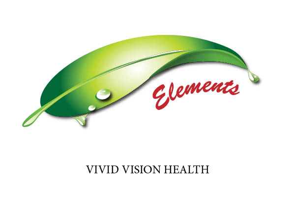
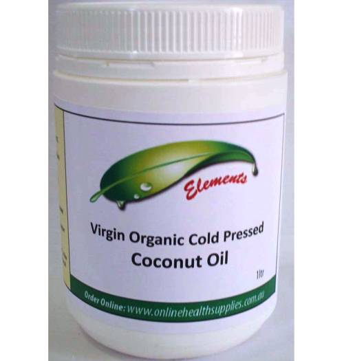
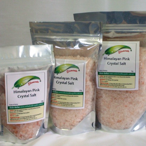
The brief from the owner of Vivid Vision Health was simple. She wanted a logo for her online health product range that was simple, green, non de-script yet memorable and unique in food packaging. She did not want a geometric shape nor did she want anything that looked like a single food product as her range varies from salt to oil. She wanted something from nature.
Our team went away and designed about 6 prototypes and from that the final design was chosen tweaked and then the name changed from her company name to a product name which allowed the design to morph again. Finally on our third presentation of her requested changes the logo was complete and the packaging labels created.
We now see these products sold online and they look beautiful.


You must be logged in to post a comment.